Trunk.js
-
-
Trunk.js
-
-

- responsive
- butter smooth
- lightweight
-
-
-
-
-
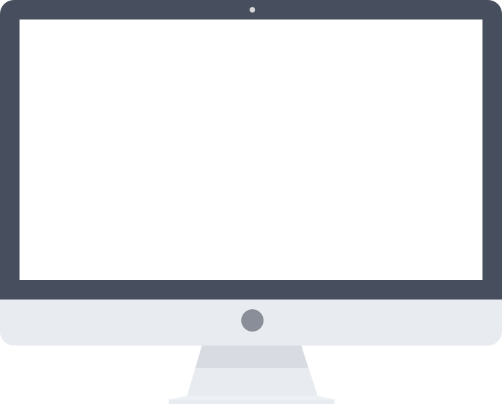
LAPTOPS
First and foremost... If you are on a Laptop or Desktop Computer, resize your window's width to your hearts content. Responsive Websites are the way of the future! Why would you want to maintain multiple sites when you can build one and let your CSS do all the work? Trunk.js helps lighten the load and gets you started by giving you a butter smooth Nav Drawer.
-
-
-
-
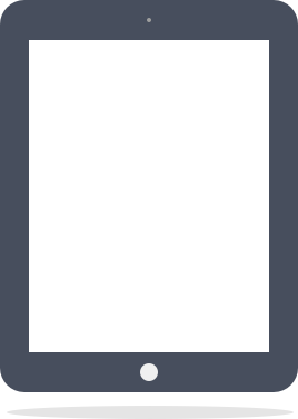
TABLETS
Trunk.js tucks your navigation into the "drawer" in portrait and displays it on top in landscape. Almost all drawers that I've come across are built with jQuery animations. The jittery or snapping results are due to this method. I've built Trunk.js to trigger the event with jQuery but it moves with CSS. This method makes the animation feel native and smooth.
-
-
-

-
MINI TABLETS
Mini Tablets are pretty similar to their big brothers (or sisters). The iPad Mini actually has the same screen dimensions as the regular iPad to make it easier for developers to code for one device. The Kindle Fires and even some of the Galaxy smartphones are so big that they straddle the fence. Trunk.js is a valuable layout for all these mini monsters.
-
-
-
-
MOBILE
Trunk.js says "No more clunky animations on your iPhone & Android device". For too long, sites have been using the Navigation Drawer lazily. It's great to free up such valuable screen real estate, but why must it ruin the UX? Can't we have both? Trunk.js responds with a resounding "YES". Open this on your mobile device & see what a Nav Drawer really feels like.
-
-